Enhancing Credibility and
Conversions Through Design
for Placementstream
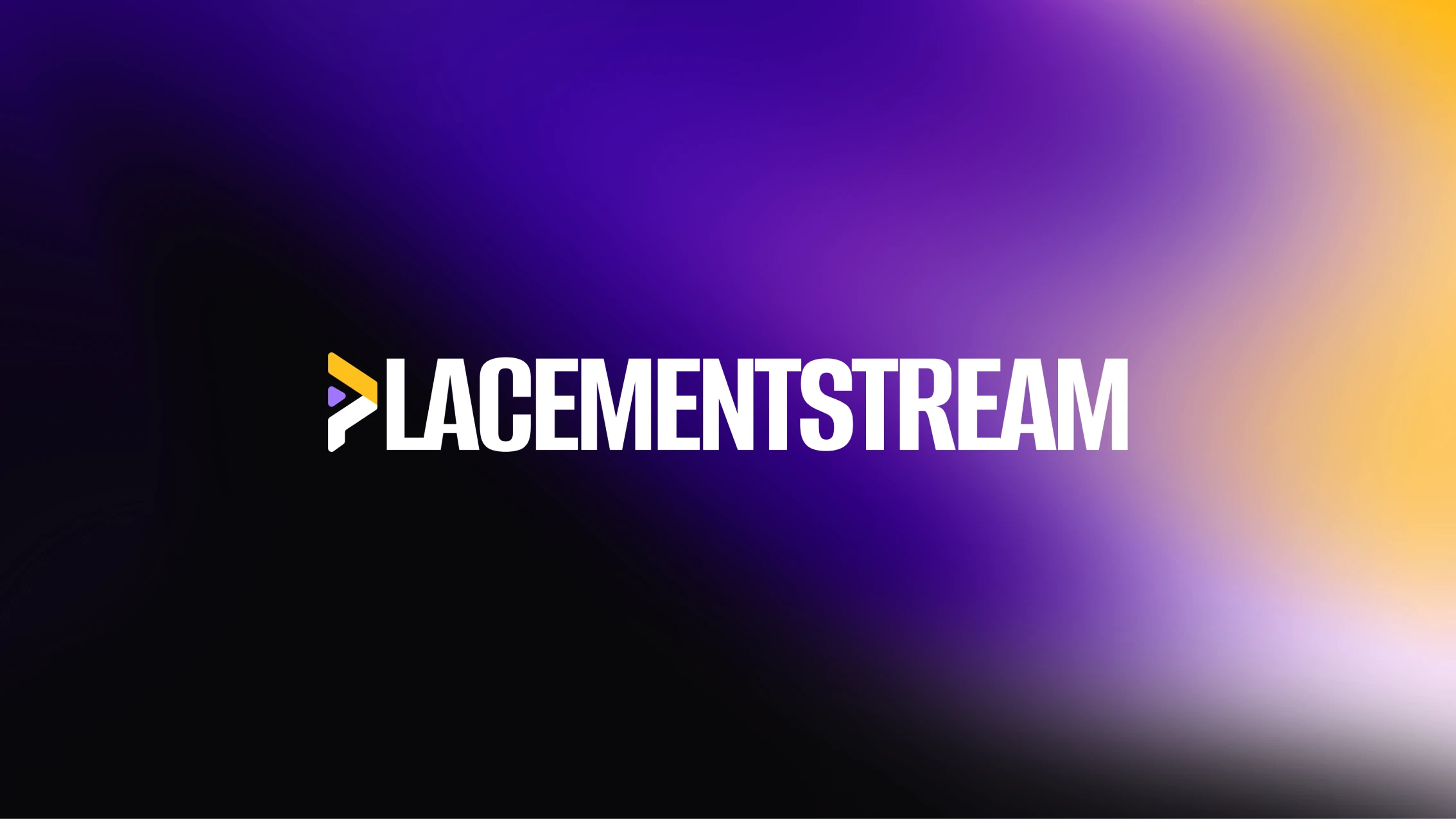
The founding team at Placementstream contacted us to build the digital presence of their AI-powered lead-generation agency. Their goal was to position themselves as experts in lead generation services tailored for recruitment and staffing agencies, helping these clients secure more leads.
What we were
brought in to do
They asked us to create their brand identity system and develop a website that conveys credibility and demonstrates to their potential clients that they are a reliable choice for generating leads.
They wanted their brand and website to look sleek yet techy so that they would stand out in a crowd of similar service-offering websites.
How we
worked together
Brand Identity Design
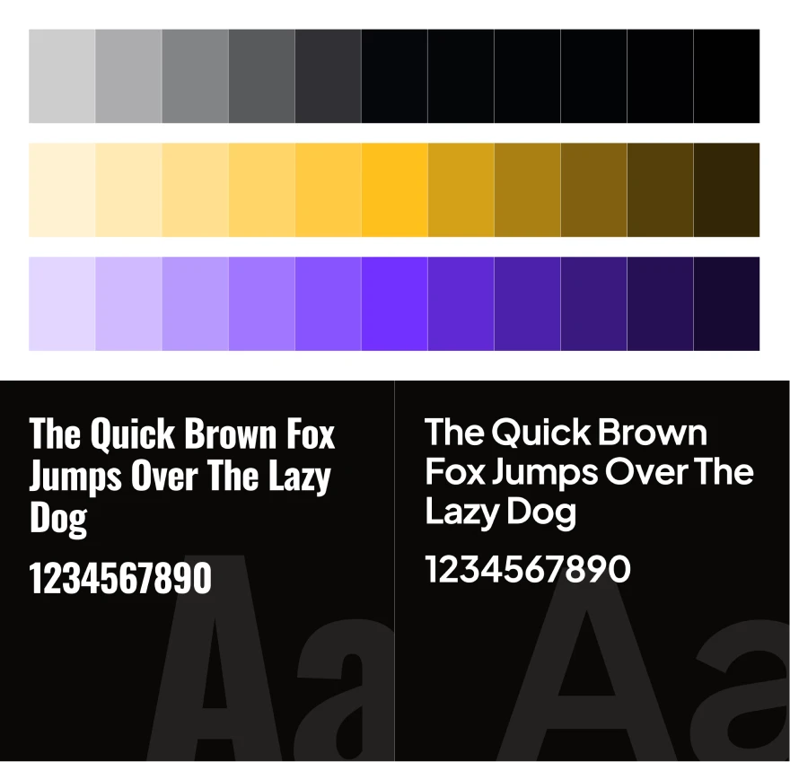
The client sought a logo and brand identity that distinctly embody an AI-driven service-offering brand. The content for the website that the team had shared was bold, outgoing, and no-nonsense. To match the vibe of their content, we chose a clean geometric typeface for the subheadings, labels, and body; and a bold condensed typeface for headlines and display fonts that conveyed a sense of boldness and corporate authority at the same time.
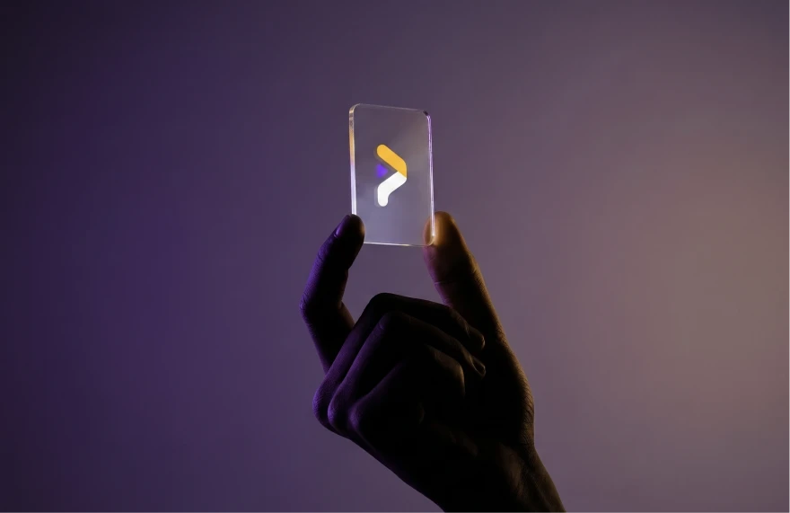
The brand mark, represented by the letter "P", features a purple accent triangle that completes the P. We meticulously selected a wordmark font to ensure a harmonious visual identity.
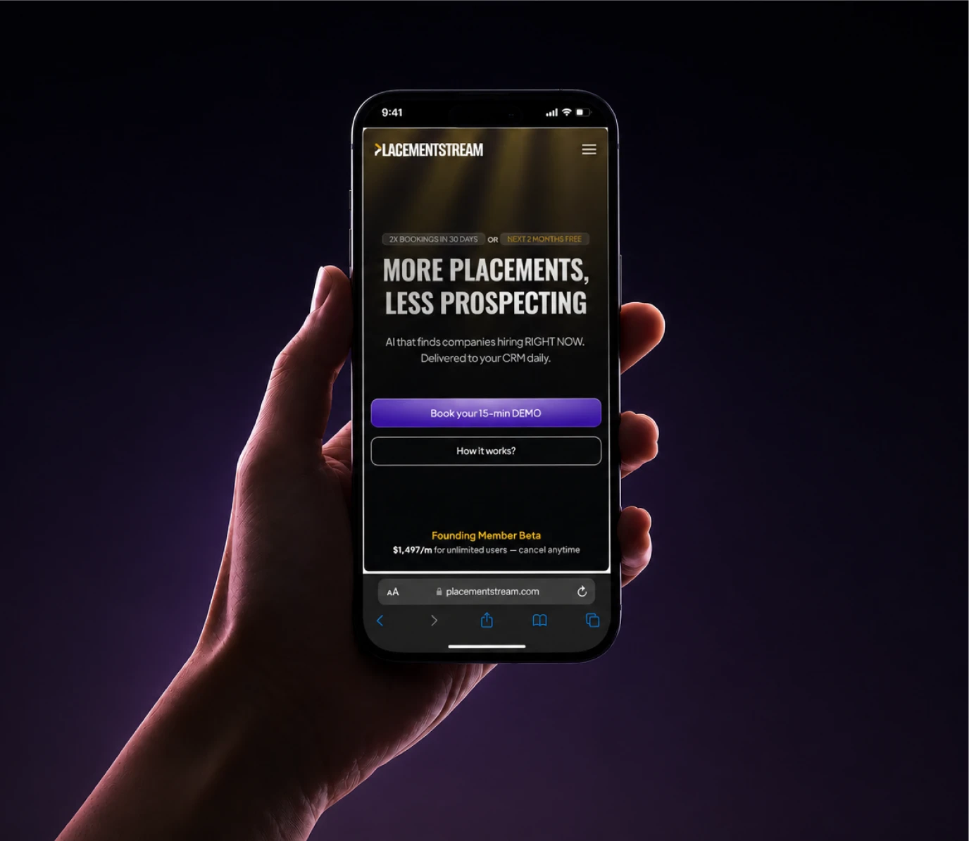
As for the colour palette, we went for a futuristic neon-leaning vibe with a poppy purple and golden-gradient accent colour on a dark background to match the current AI-glowy vibes that had been trending at that point.
Website Design
With the color swatches defined and the typography already chosen as part of the previous phase, we already had a solid foundation to start upon.
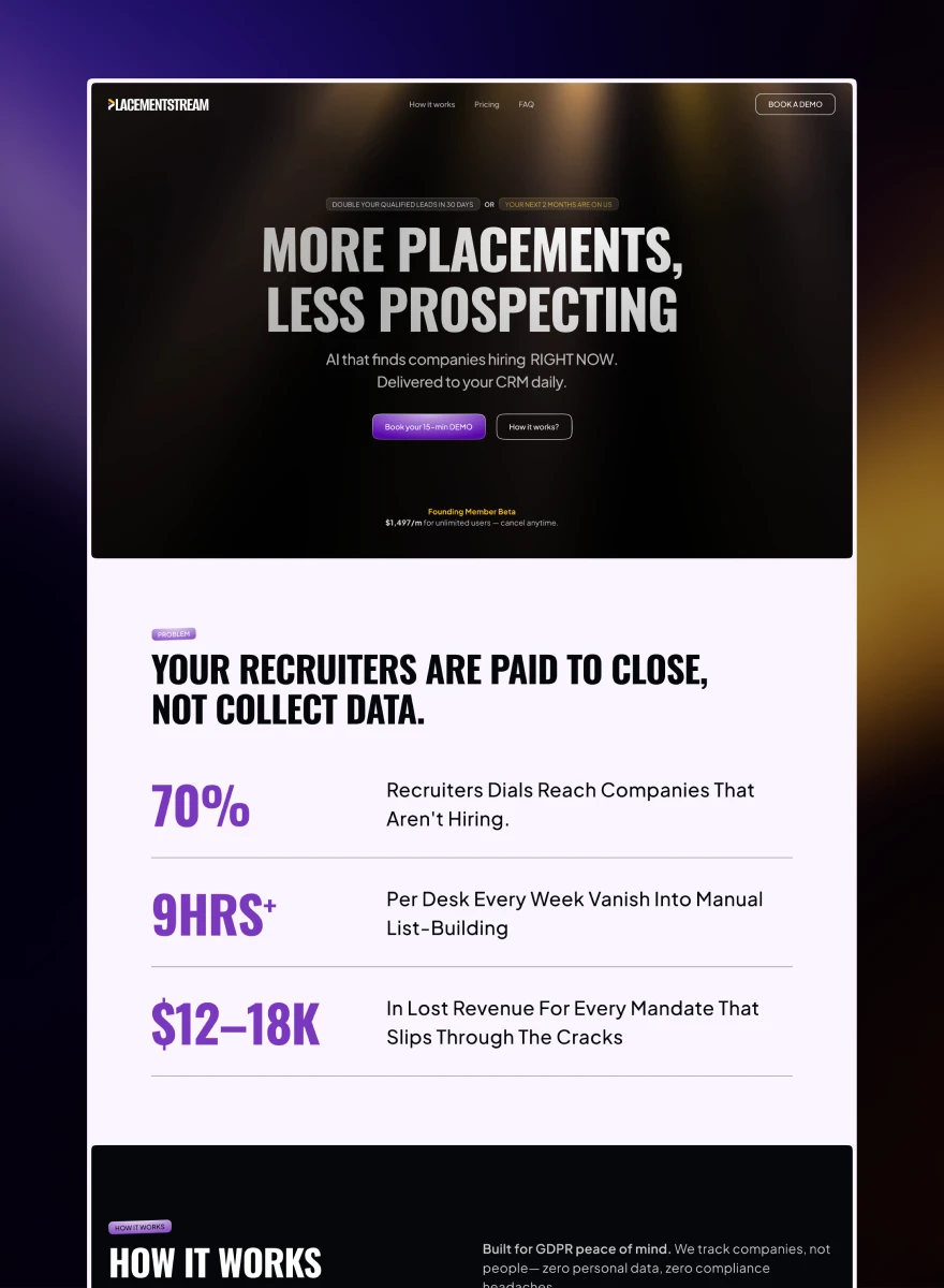
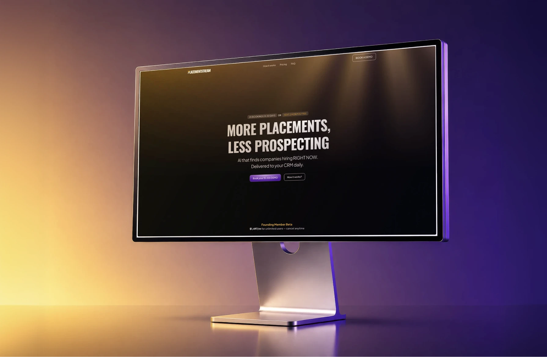
The idea of the hero section was to display the main message and benefit of the startup front and center. The overall website theme was chosen to be alternating dark and light, starting with the hero section in dark. To focus on the message more in the hero section, we added a golden on dark god-rays background that is minimal and doesn’t draw much attention. The visual design decision behind the god-rays being used metaphorically was to signify hope on dark days.
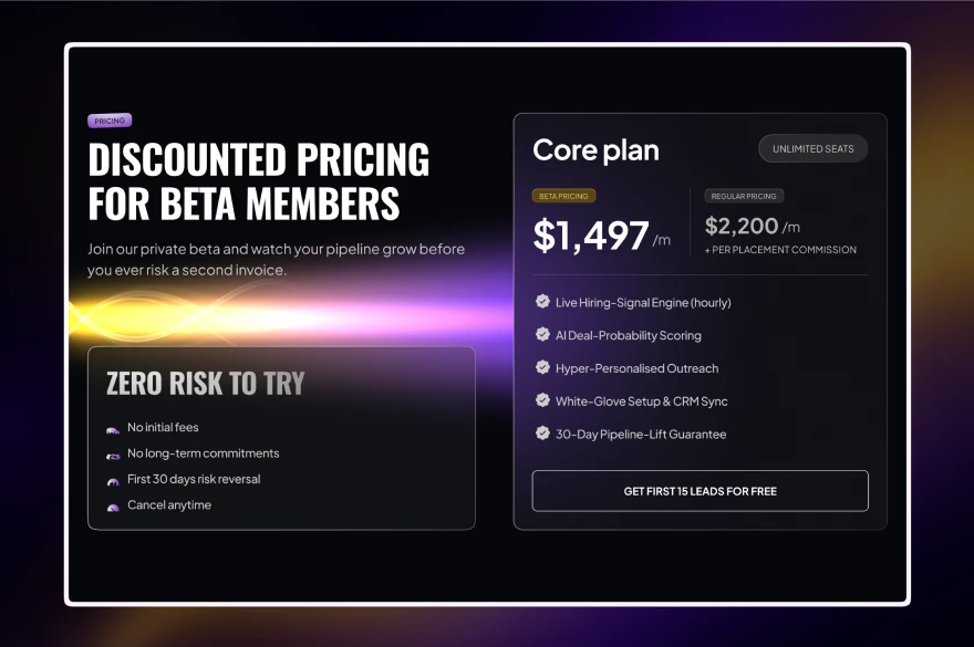
The following section after the hero focused on the problem that the staffing/recruitment agencies face while looking for leads with significant metrics to back them up. The process section is a simple grid-type design to discuss the major steps and features of the pipeline. The pricing section is the design highlight of the website with a light beam visual asset custom-designed for the website theme, highlighting the discounted BETA offer, available for the first few customers.
Then a simple FAQ section and a visually appealing footer+CTA section remind the visitor about the hard ROI gains of using the service and a clear actionable CTA button to take action as the last step.
The Output
A brand identity that represents an AI-driven service-offering business, standing out among the many similar-looking brands in this segment, and a credible and modern website that communicates the offer very clearly to its visitors, urging them to take action.